Plog de Dag
Plog de Dag
As part of a Visual Design course in the bachelor’s program Communication and Multimedia Design (CMD) at the Amsterdam University of Applied Sciences, the goal was to develop a unique visual identity for the Plog de Dag campaign page on the City of Rotterdam's website. This campaign aimed to inspire citizens to pick up litter while jogging. The project involved creating a design that both adhered to the city's established house style and encouraged active participation and community engagement.
Inspiration
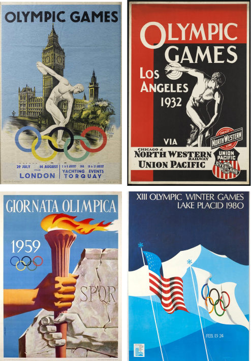
To achieve this, the illustration was designed with inspiration from Olympic posters, aiming to capture a dynamic and sporty feel that resonates with Rotterdam’s energetic spirit. The image portrays a man in sportswear catching a can mid-air with a trash pick, exuding pride and satisfaction. Using the municipality’s signature 2D style—characterized by bold square shapes and bright colors—the design conveys both emotion and complexity while maintaining a minimalist aesthetic. This approach effectively supports the campaign’s message while aligning seamlessly with Rotterdam’s visual identity.
Typograpy
The visual identity of the municipality of Rotterdam is known for its flexibility, particularly in font usage. In designing the webpage for the "Plog de Dag" campaign, these guidelines were carefully applied, using the municipality’s font, Bolder, with modifications to convey a strong, impactful message. Font size, weight, and alignment were adjusted to suit the campaign's context and purpose. Inspired by the 1932 Olympic Games poster, the campaign title uses letter positioning to create a bold, grand effect, with an enlarged “P” that draws attention—much like the oversized “O” in the iconic Los Angeles Olympic poster.
Colour use
To capture the atmosphere of Plog de Dag, a colorful illustration was created featuring various shades of green. This key color, integral to the logo and corporate identity of the municipality of Rotterdam, also reflects the campaign's themes of sustainability and nature. A green background was utilized to create vibrant contrast with other elements, such as people, animals, and waste bins, allowing them to stand out. The illustration was designed to be lively and cheerful, reinforcing the campaign's positive message and encouraging engagement with the initiative.
The illustrations on the website incorporate a variety of colors while maintaining alignment with the municipality's corporate identity. Green, gray, white, and magenta were utilized throughout the content, effectively representing the municipality and ensuring the design is both recognizable and cohesive. Magenta was specifically selected for all call-to-action buttons to distinguish this function from the rest of the site, enhancing clarity and usability.
Elements
-
Rotterdam's More information links
A key aspect of the corporate identity of the municipality of Rotterdam is the use of contrast gray areas as backgrounds for text, primarily to highlight "more information" links and important sections within long passages. This element was integrated into the design to establish a recognizable- and clear structure, ensuring that essential information stands out while maintaining a visually organized layout.

-
Citations
The same contrast gray style was applied to quotes that convey a personal or inspiring tone. This approach fosters visual coherence across various design elements, aligning with the overall aesthetic of the municipality of Rotterdam.

-
Button
Another element introduced in the design is the use of magenta for call-to-action buttons. This bold color contrasts effectively with the green background, drawing attention and making key actions stand out.

-
Fold-out compartments
The design features fold-out compartments, each marked with a ">" icon to indicate the availability of additional content. By clicking the icon, users can easily open or close these compartments, enhancing both clarity and interactivity on the website.

Page Design
The page design features an illustration of a man picking up a can with a garbage picker, symbolizing the project's core mission of cleaning up litter. This illustration is prominently displayed alongside the initiative's name, Plog the Day.
The top banner provides essential information about the project, outlining its significance and the registration process. The registration form is conveniently placed in a drop-down box, highlighted in a lighter shade of green to improve visibility. To add depth, overlapping layers were incorporated in the signature Rotterdam banner style.
Below the gallery, a YouTube-embedded video addresses the litter problem, underscoring the project's urgency. This format allows for easy full-screen viewing on smaller devices.
At the bottom of the page, articles about plogging are presented with relevant images, offering additional background and inspiration for potential participants. A newsletter sign-up function is also included to engage users interested in receiving more content related to the initiative.
The website layout transitions from a single column to a double column starting at 414 px, optimizing screen space and enhancing the clarity of information presentation. This double-column format is maintained up to 1680 px, beyond which the side margins become wider. For screens larger than 1680 px, the expandable boxes automatically open, allowing for a more dynamic display. Additionally, the introduction of the second column reveals the lower part of the artwork, further enriching the visual experience.
Structure, lay-out and breakpoints
The municipality of Rotterdam employs a responsive design for its website, adjusting the number of columns based on screen width. For screens narrower than 414 px, the layout utilizes four columns, while wider screens display twelve columns. This approach ensures optimal readability and user-friendliness across various devices. The layout created aligns with this column structure, effectively reflecting the website’s content and design.
The layout employs a two-part approach. On larger screens, it features two columns, each six columns wide. The left column showcases an illustration of a man holding a can with a pick, while the right column presents the title "Plog the Day" alongside a brief text highlighting the importance of plogging. On smaller screens, the layout adapts to a single column four columns wide, displaying only the upper body of the man, with the title and text positioned below the illustration. This design ensures that the message about plogging is communicated clearly and attractively, regardless of screen size.


